

Frontend Mentor Challenge - Interactive Ratings Component
My approach, the feedback I received, and next steps


Hey Hashnode World! Today I would like to talk about a challenge I very recently completed from Frontend Mentor. It is a responsive interactive rating component made using HTML/CSS and JavaScript. It took me a few days to complete, so I felt pretty confident about my submission, but there were a few things wrong that I'd like to discuss with you here. Pull up a chair and let's talk!
So what is Frontend Mentor anyway??
Frontend Mentor, as the name would imply, is a website made for people learning frontend web development. I've known about it for a while, but only within the last year have I felt confident enough in my skills as a developer to attempt any of the challenges. Now that I've finally started, I can't stop! It's a great way to "learn by doing" rather than just following tutorials or online classes as I had been for so long. I love the community, getting real, honest feedback on my code from other developers, and working on interesting, real-world projects that someone might actually use. They provide an example with mobile/desktop layouts and your job is to create a version of it as close to the specifications as possible, using whatever frameworks/languages you see fit. It's as awesome as it sounds and with each project, your skills (hopefully!) improve and you learn a lot from other people.
My process
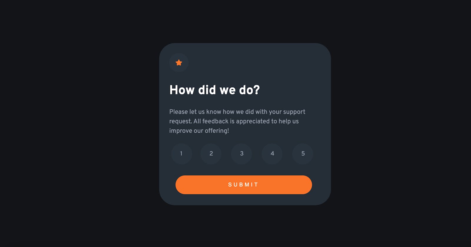
As with every project, the first order of business was to structure the HTML. I found this to be a little bit more challenging than other projects I had done with basic HTML/CSS since I had only ever done one other project using JavaScript on my own, but I think the key is to not get overwhelmed and don't get bogged down with implementing too many details at once. So I just focused on creating one card at a time, as there were two cards (one for each state). I then hid the card that I wasn't working on using visibility: hidden in the styles.css file.
One of the things I was worried about was styling the form, or which HTML element I would even use for the form. My initial thought was to just put everything in a div and make the radio buttons span elements, but I scrapped the idea and put everything into an HTML form element. I guess form styling is one of those things that should be a given, but I wasn't even sure I could apply styles to buttons or radio buttons, because I've only ever made links that look like buttons and have pretty limited experience working with forms.
After I had everything structured the way I wanted, I moved on to the CSS. Here's where my first flub happened. I set the .wrapper class to position: relative to center the card div using position: absolute. I learned upon submission that this is an outdated technique and that flexbox or grid is preferable to center content on the page. Previously, I had only been using flex or grid to center content, but I wanted to try something different and it did not work. Lesson learned! I used the same technique to center the number inside of the radio buttons (this was acceptable) but for the main card divs, this should be avoided.
I played around with some values to get my cards looking pretty close to the specifications, so I then created a script.js file to do some basic DOM manipulation. Here is where things got pretty messy. A few Google searches for "javascript form submit eventlistener" and "javascript form submit action" yielded limited results, so I felt like I was kind of out in the wild at this part. I found a few useful links from Geeks for Geeks and of course the old standbys Stack Overflow and MDN, so I picked up the breadcrumb trail and went from there. My first step was to create variables for each of the relevant elements on the page: one for the "ratings" buttons, the submit button, the cards themselves, and the rating element that displays what the user selected once the "submit" button is clicked. For each of the rating buttons, I added an event listener that listens for a click on the element and retrieves the id value using e.target.id. Then the string received gets split using the "-" since the ids were formatted "ratings-N". The last element from the array is then retrieved, and that is the value the user selected.
To set the value on the following "thank you card", I changed the innerText and value of the span element to reflect the current rating retrieved in the last step. This part confused me a little bit because JavaScript uses innerText, innerHTML, and value, and they all have similar behavior but do completely different things. From what I can gather, value represents the default value at page load, innerText sets the text content of a node and its descendants, and innerHTML lets you rewrite the entire HTML element that appears on the page.
I then added some basic validation to ensure that a value is selected before proceeding to the next page. If a value isn't selected (user-rating.value == undefined) an alert will pop up telling the user to select a value.
In conclusion...
The feedback I received mentioned doing a CSS Reset to avoid repeated properties so that is what I plan on implementing in the future. I need to do a little more research but I think it's just to make everything more consistent and improve readability. In addition, a suggestion was made to add a hidden legend and fieldset to my form for accessibility and to prevent users from clicking more than one rating, respectively. You can view my solution to this project here if you want to play around with it! Also, if you have any other suggestions on how to improve my code please let me know! Thanks for reading!
